Reading the Route: A Practical Signage Test for Dunbar’s Public Buildings
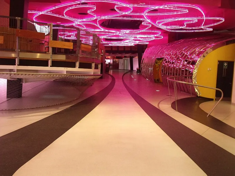
Photo: Elliott Brown, CC BY 2.0, via Wikimedia Commons
Why Wayfinding Deserves a Closer Look
A public building makes its first impression before anyone speaks to a member of staff. The entrance, the corridor, the lift button and the noticeboard all answer a simple question: do I know where I am going, and do I know how to get back? For people who use a building every day, these details fade into the background. For a first-time visitor, they can determine whether an appointment is attended, a query is raised or a service is used at all.
This signage test does not assess the quality of services provided inside Dunbar’s public buildings. It examines something narrower and more practical: whether the signs, maps, room numbers and temporary notices actually in place allow an unfamiliar visitor to move through a building with confidence. The route is deliberately ordinary — entrance, reception, corridor, lift, waiting area and exit — because that is the route most people follow.
The findings are not about expensive redesign. In many cases, the most useful improvements are modest: a clearer line of sight, a consistent room-numbering system, a temporary notice that says when it will be removed, or a map placed where a person actually stops to make a decision.
Starting at the Threshold
The test begins outside the main entrance. A good entrance sign does more than name the building. It confirms that this is the right place, indicates where the door is, and, where relevant, shows the opening hours and the main reception point. If the entrance is locked or controlled, the visitor needs to know what to do next without trying several handles.
At one building, the entrance sign was clear but the reception desk was not visible from the door. A visitor could see a corridor and a staircase, but not the point at which help was available. At another, the main door was obvious, but a side entrance used for appointments had a smaller sign that assumed the visitor already knew which door to use.
These are not failures of building design. They are failures of sequence. A sign that works in isolation may not work when someone is anxious, late or carrying paperwork. The practical test is whether the first three decisions — have I arrived, which door do I use, and where do I ask for help — can be answered without guessing.
Corridors That Assume Local Knowledge
Corridors are where wayfinding most often relies on unspoken local knowledge. Staff know that Room 4 is past the kitchen and turn left at the noticeboard. Visitors do not. A corridor sign that reads “Interview Rooms 1–3” is helpful only if the visitor already knows which direction to take and how far to walk.
The audit route looked for three things: consistent directional signs at decision points, room numbers that appear in the same order as the rooms themselves, and confirmation that a visitor is still on the right path. A single sign at the start of a long corridor is rarely enough. A second sign at a junction, or a simple “Rooms 1–5 continue ahead” notice, can prevent a wrong turn.
Temporary notices deserve particular attention. Many public buildings rely on paper signs for maintenance, room changes or one-off events. These are useful, but they can also contradict permanent signage if they are not dated, removed promptly or placed at eye level. A temporary notice that says “Meeting moved to Room 12” is helpful only if the visitor can find Room 12. If the permanent sign has been covered, the temporary notice becomes the only route — and it may not be enough.
Lifts, Stairs and the Question of Choice
A lift is not simply a machine. It is a wayfinding decision. The visitor needs to know where the lift is, whether it serves the floor they need, and what to do if it is out of service. A sign that says “Lift” with an arrow is a start, but it may not answer the practical questions: is this the only lift, does it reach the first floor, and is there a step-free route from the lift to the relevant office?
Where stairs and lifts sit side by side, the signage should make the choice clear without privileging one route. A visitor who cannot use stairs should not have to discover the lift by trial and error. A visitor who prefers stairs should not be sent on a longer route unnecessarily.
The test also considered lift lobbies. Floor numbers, room ranges and a simple “You are here” marker are small additions that reduce hesitation. Without them, a visitor may leave the lift on the wrong floor and have to return to reception — a minor inconvenience for some, a significant barrier for others.
Waiting Areas and the Need for Reassurance
Waiting areas carry a surprising amount of wayfinding work. A visitor who has found the right building and the right corridor still needs to know whether they are in the right waiting area. A sign that names the service, rather than only the room number, is more useful than one that assumes the visitor understands the building’s internal vocabulary.
Clear signage at the waiting area should confirm three things: the name of the service, the room or desk where the appointment will take place, and the process for announcing appointments. If a member of staff will collect visitors, the sign should say so. If visitors are expected to watch a screen or listen for a name, that should be clear from the outset.
This is also where temporary notices can cause confusion. A handwritten sign reading “Please wait here” is reassuring only if it is placed where visitors actually wait. If it is taped to a door at the far end of the corridor, it may be missed entirely.
Leaving With Confidence
The audit route ends at the exit. This is often overlooked in wayfinding reviews, but leaving a building can be as uncertain as entering it. Visitors need to know how to return to reception, how to find the main exit and, where relevant, how to reach public transport or the street.
A simple exit sign is not always enough. In larger buildings, a visitor may need confirmation that the corridor leads to the main entrance rather than a fire exit or a staff-only door. Clear, consistent signage at the final decision point is a small courtesy that makes the whole visit feel more manageable.
What Dunbar’s Organisations Can Fix Quickly in 2026
The most useful improvements identified by this test are not costly. They are practical and can be addressed within existing maintenance and communications routines.
- Check the first three decisions at every entrance: arrival, door choice and reception point.
- Place directional signs at junctions, not only at the start of corridors.
- Use room numbers and service names together, rather than relying on internal shorthand.
- Date temporary notices and remove them when they are no longer accurate.
- Confirm that lift signage answers the practical questions, not just the location of the lift.
- Make waiting-area signs say what will happen next, not only where to sit.
- Walk the exit route as a first-time visitor would, including the route back to reception and the street.
Wayfinding is not a decorative extra. It is part of how a public building behaves towards the people who use it. In 2026, Dunbar’s organisations have an opportunity to treat signage as a service in its own right: clear, consistent and written for the person who has never been through the door before.